
A rebrand for an established IT consultancy whose identity hadn't kept pace with its growth.
Scope of work
Brand Identity
/
Deliverables
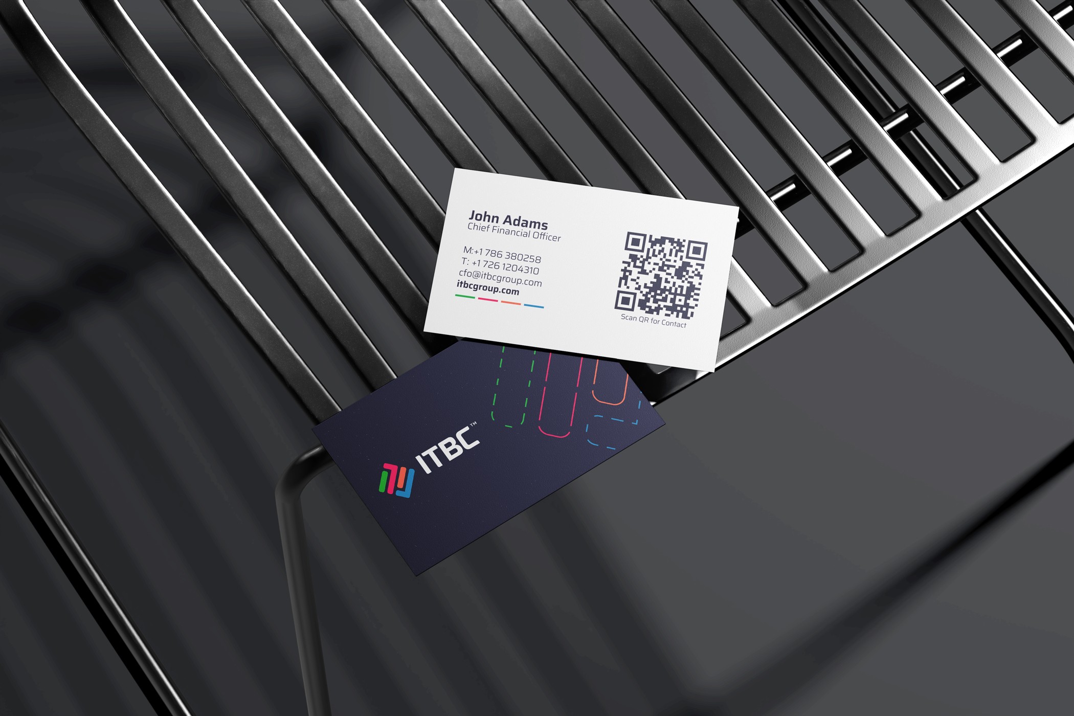
Logo & visual system · Color system · Typography · Stationery, corporate folder & ID system · Presentation & social templates
Client
ITBC Group
Industry
Technology
ITBC had built something solid — a strong reputation, important clients, and a path that had taken the company from Latin America into Spain. What hadn't travelled with it was the brand. The identity still belonged to an earlier chapter, created before that growth, and it no longer reflected the company ITBC had become.
The previous identity had served the company well in its early years. But as ITBC expanded, the distance between the work it delivered and the image representing it kept growing. The brand simply needed to catch up with the company.
The approach
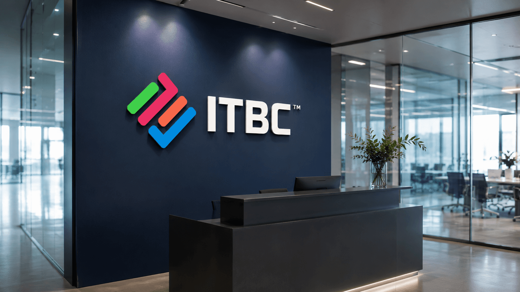
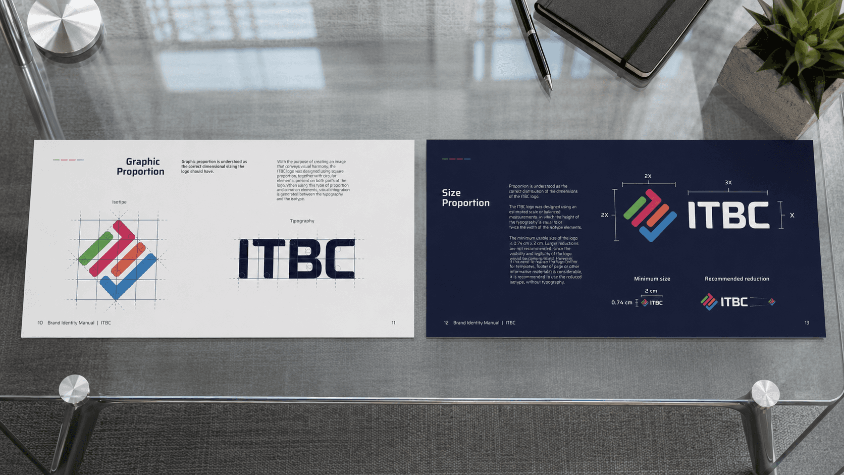
We built the new identity around one idea: connection. The symbol synthesizes the letters "IT" into an interlocking mark — four strokes that read as elements, processes and projects coming together.
We paired it with Saira, a clean sans-serif chosen for its solidity, and anchored the system on a deep navy that keeps everything composed and unmistakably technical.
The colour system
The four colours — green, magenta, orange and blue — aren't decoration. They're structure. Each one lets ITBC code and separate its services, areas and projects while keeping the whole unmistakably one brand.
A system with range: it flexes across a deck, a folder, a profile or a screen without ever losing its identity.

The result
9
Brand Applications
4
Color-coded Streams
ITBC ended up with an identity that finally matched the company behind it — current, distinctive, and consistent across print, digital and social.
A system designed to grow with the business rather than age against it. It still represents the company well today, which is the truest test of an identity.
